
Hit once over with a strong tone (dark brown) wash on the body and gun. Gives it a dirty feel.
#hobbystreak day 39
Self taught noob paints and builds (mostly) Warhammer 40k
Hit once over with a strong tone (dark brown) wash on the body and gun. Gives it a dirty feel.
#hobbystreak day 39

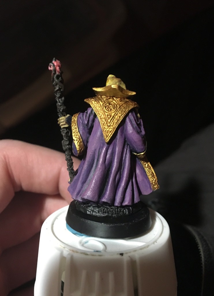
Materials used: one brush, Vallejo black brush on primer, and scale 75’s heavy metal and dwarven gold paints. The base is with pva glue and playground sand.
Dead simple, I just drybrushed the metallic over the black primer. Go google how to drybrush miniatures if you dont know.
#hobbystreak day 38 #double post
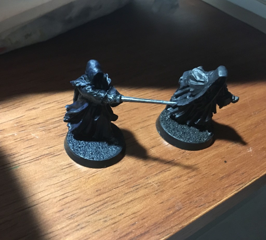
Inspired yet again by the OG Vince Venturella, this time by his painting black video, I decided to start painting these black riders with a basecoat of a near-black and shading with a black wash. If you basecoat pure black, you cant shade with a wash and get any meaningful contrast between raised surfaces and recesses.
For the left wraith I basecoated dark blue and for the right one I basecoated dark grey. Nighttime vs daytime nazgul. Something something its always sunny reference.
I plan to highlight these some more (the hoods offer some good practice edge highlighting) but even with this intro of basecoat and wash I like where these are going. Improved from just plain black primer.
While the base of the night rider looks like the body, I actually painted it dark grey and then washed it with blue tone. It seems like blue tone works so well for this that I could easily turn day wraith into a night wraith with a single blue tone coat.
#hobbystreak day 38

I dabbed on some white with a bit of spongy foam on this guardian in an attempt to make dense star looking patterns and got mixed results. I accidentally put on too much paint in some places so it globbed together into a solid streak instead of looking like a clump of individual stars. But in other places I got the desired effect. I couldnt get the very deep into any recesses without smearing the white so I’d recommend this technique for wide spaces rather than textured ones.
It’s also possible I had too much paint on the foam in the first place, I only did one test so I can’t claim to have a deep understanding of how this method might be tweaked for better results.

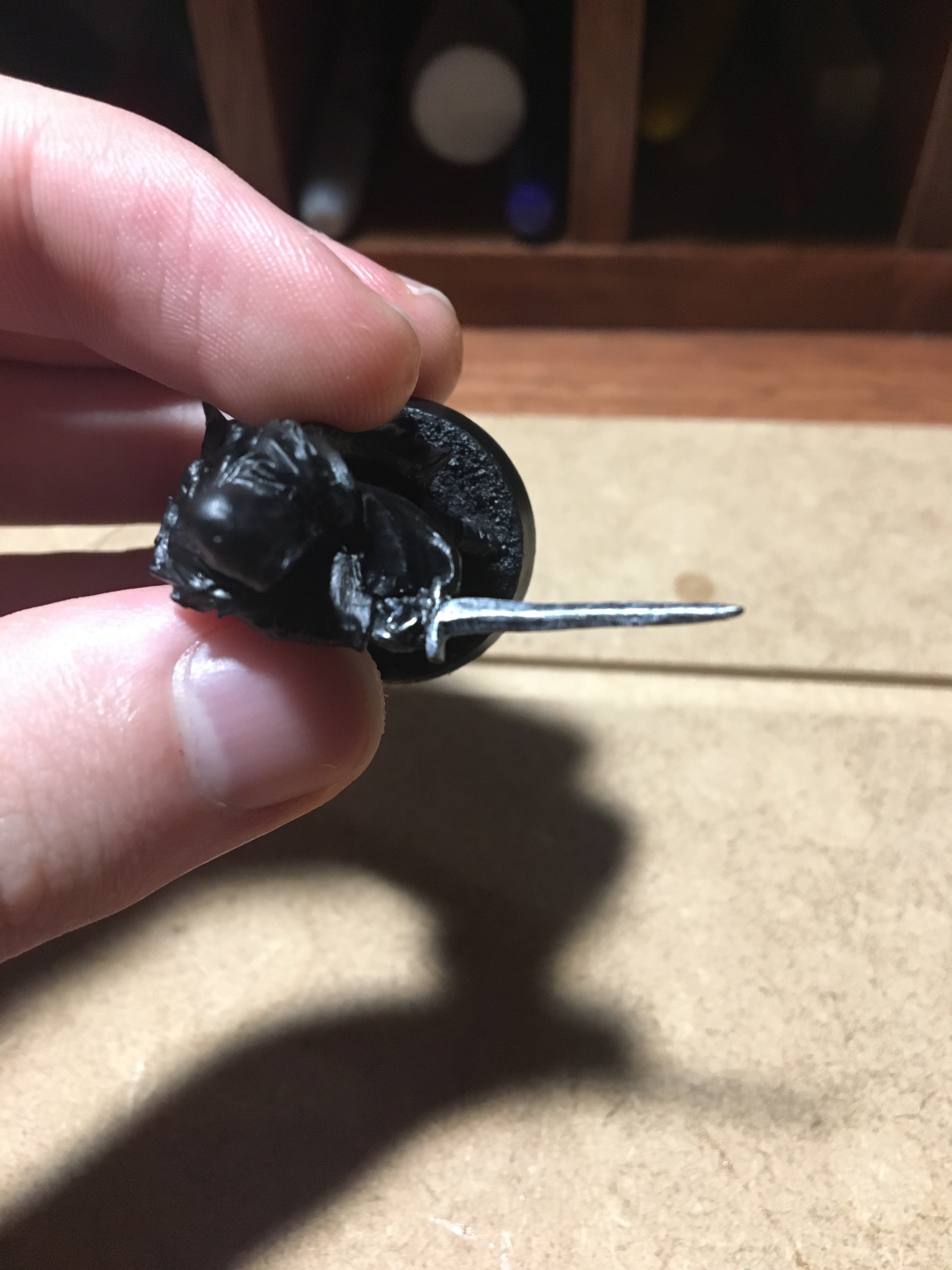
I glued a piece of steel pin in this arm rather than a full magnet. All good on the dry fit but when I glued it in some of the pin stuck out. I tried a variety of solutions to cut the pin flush with the arm: using my file (too slow progress), my sprue snippers (PLEASE don’t try this, it did nothing useful AND damaged my snippers), and finally a big ol box cutter knife on the recommendation of a hardware store employee and still couldn’t cut the pin to size. So I turned to my greenstuff.
“If you can’t beat em, join em” became my motto and I built up greenstuff around the protruding pin while doing my best to blend it into the existing arm with my patience as a limiting factor. Priming and painting it will be the real test but I think I did ok.
#Hobbystreak day 35
Staff is still in WIP status because I ended up filing down a mold line and redoing the primer. I understand primer is best left to set for 24 hours to I choose to wait before adding more layers over it.
More angles:
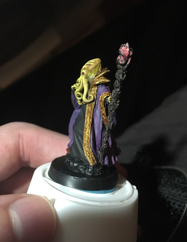
#hobbystreak day 35

This WIP is WhIPping along hahahahaha ok couldnt resist
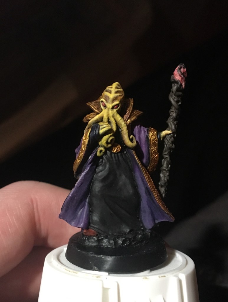
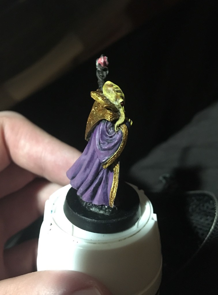
Today was a lot of playing around with blending and shading on this octopus head plus some other odds and ends Like his shoe and staff and eyes.

A lot of today revolved in part around seeing what I could do to reset new changes. I had shaded the underside of the head but remembered that animals have lighter colored bellies than tops most of the time. So I blended some ice yellow and normal yellow into the underside of the head to imitate the belly of an octopus. And then lined the meeting of the head and the cloak with soft tone.
I tried putting some “purple tone” on since Vinny V said that purple can look good in yellow shadows. But I think I overdid it and now my octopus is looking kinda sickly. Soft tone wash is the answer to warm it up again? Idk.

I like how I got the look around the eye sockets with a payer of yellow over pure ice yellow. And a bit of off white under the eyes glazed with yellow.
I’m scared to try it on the head ridges because the sculpture detail there is kinda ambiguous which puts the onus on me to pretty it up.

Another thing I did yesterday was the black robe. Painted dark grey and then hit with targeted black wash to darken it down and alas I think I added too much so another highlight step with dark grey could be in order.
#hobbystreak day 33

Fingers crossed that this greenstuff alone solution will do the trick. Perhaps I should have added super glue in first.
I used a soft tipped ‘clay shaper’ tool to sculpt the greenstuff and I used saliva on the tool to keep it from sticking to the epoxy putty.


I mixed equal parts blue and yellow, nothing fancy.
I rolled a tiny snake out of GS between my fingers and then stuck it into a drill hole. Once I got enough into the slot I broke the snake off and then went about smushing the greenstuff into and around the hole with my shaper tool.

Remember to let GS dry for a long time, like 24 hrs at least. It takes awhile to harden into its final form even though it starts to harden within the hour of mixing it up.
#hobbystreak day 31
Next thought is how do I prime the magnetized arms in a way that isn’t a drag…. especially the ones with pins that kinda wobble when you touch them.
We’ll see what I decide on when we get there.
#Hobbystreak day 30
Inspired by the podcast Trapped Under Plastic, let’s see my TRUE WIPs, warts and all.

Let’s start with good news. I painted up this wraith’s sword and gauntlets and I think its coming along in the right direction. I got a little crafty with the recipe.
All credit due to youtuber Ninjon for inspiring me to mix colors into my metallic paints.
In his video he mixes gray paint and some other colors into a bright aluminum colored metallic paint to get darker shades. Me, not having dark shades of metallics on hand (despite me trying to buy a dark shade of metal… turns out scale 75 ‘heavy metal’ is pretty dang bright), decided to give this mixing method a try.
But I used black ink to mix instead of grey paint.
At first I got a dark grey that I used as a base coat for the metal on the ringwraith. But as the ink and paint solution sat on my palette the ink overtook the paint’s natural silver hue and I ended up with glittery black. Could be good for something else but not what I wanted here.
To highlight the metal on the ringwraith I used straight up heavy metal. Edge highlighting is still new to me so I laid down the heavy metal with caution on the sword edges. And then I went for the ridge in the center and laid down a big ugly streak of paint by accident.
To compensate for my mistake and for the fact that heavy metal looked way too bright next to the black metal, I kinda swiped heavy metal messily along the blade to imitate scratch lines and ended up with a visually textured surface that pleased my eye. Overall still too bright but when I hit it with some washes I think it will end up looking just right.
For my next wip I played with drybrushing red onto a couple of my starry night guardians to see what happens and.. well I’m less than thrilled with the results.


I tried to mitigate the red by glazing navy over it but it didn’t do much to it.
#hobbystreak
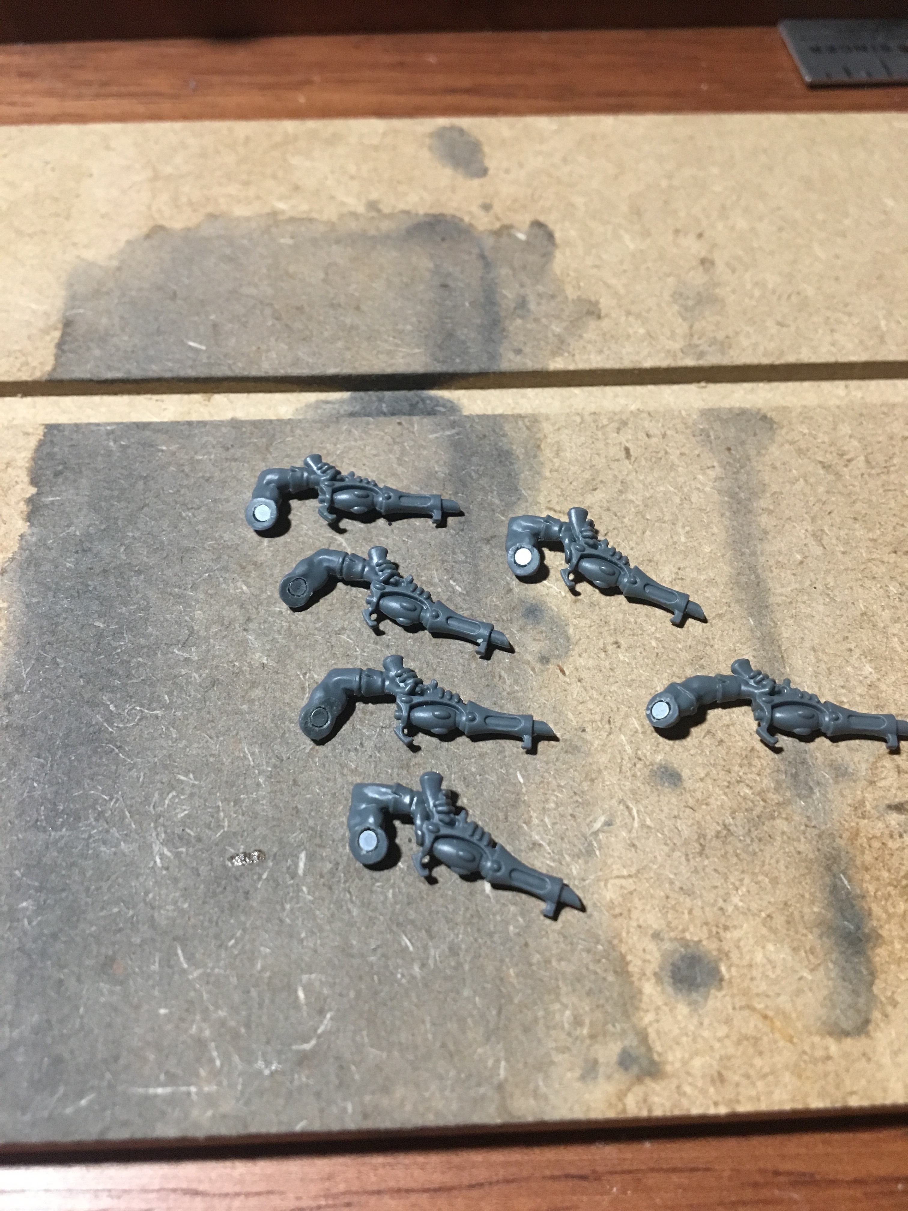
This went mostly without incident. I had to redrill the arm holes so that the magnets would go in all the way, I guess the dried glue from before messed with the fit the second time around.
Time will tell whether the magnets were glued secure in the long term.
#hobbystreak
